by Barbara Lamprecht
Photos (2014) by Cameron Carothers
It is rare to find a house designed by Richard Neutra (1892 – 1970) in absolutely original condition. Still rarer to find it beautifully maintained. Rarest of all to learn that it is a member of Neutra’s fabled “Silverlake Colony.” And while his ubiquitous use of silver paint on trim is well known, beyond rare is the existence of a silver wall.The wall stands in the Kambara House.
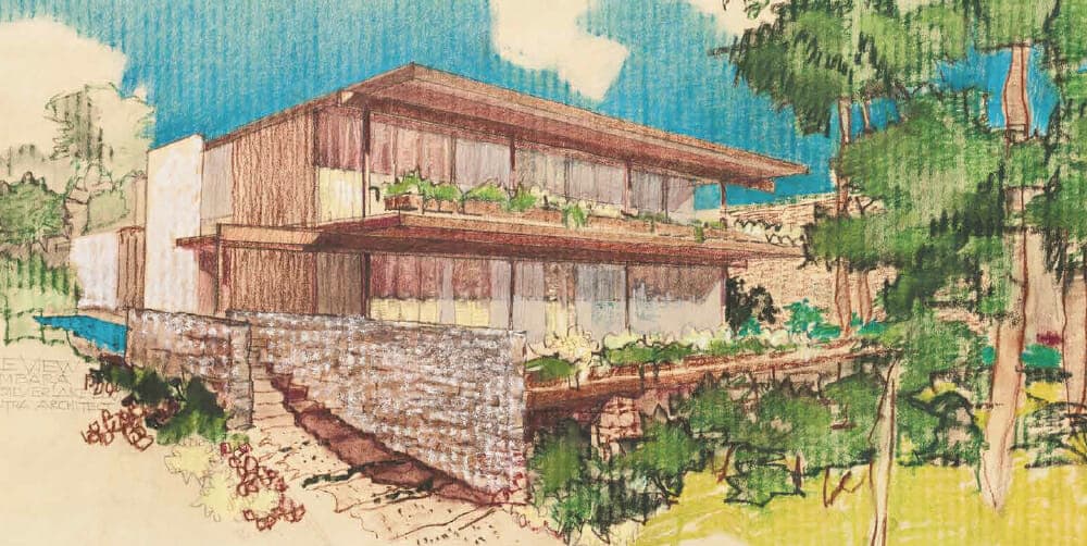
Completed in 1961, the Kambara House is one of nine dwellings Richard J. Neutra designed between 1948 and 1961 as an integrated group in Silverlake, Los Angeles. After 53 years, it is being sold by the original Japanese-American family who commissioned it. In the Colony, Neutra’s intention was to demonstrate how his unique “kit of parts” could be manipulated so that a group of houses shared a unified theme without compromising an individual identity for each house. Visiting them reveals just how profoundly Neutra carried this idea through.Yes, there are elements and strategies in common throughout weaving the Colony together, but each residence is almost strikingly different in its spatial sequences, layout, materials (whether included or left out, or used in some new way), colors, and overall feeling. Neutra wasn’t kidding. The story of the Colony is fascinating. In the late 1940s, Neutra teamed up with Holger Fog, a Danish nursery man and friend, to develop land to his design, ensuring commissions and publicity. It wasn’t the first time Neutra co-partnered with another investor and acted as architect; that was in 1937, with the eight-unit Strathmore Apartments in Westwood, now listed at the state level of significance in the National Register of Historic Places.
On Fog’s behalf, Neutra purchased choice property comprising nine lots on hills rising on the east side of the Silverlake reservoir, a block from VDL Research House I, the original Neutra family home and office practice. Some houses, such as the 1948 Treweek and Sokol houses, are roughly on the same grade as the reservoir. Others, including the Kambara, are situated above, following the two-way slope rising both to the south and the east. For each lot purchased, the owner agreed that Neutra would design the residence. If construction had not commenced within two years, he would sell it back to Neutra and Fog with a minor upcharge. George and May Kambara were successful in choosing their lot: their request was a bit earlier than that of the Inadomis, Neutra acknowledged in a letter, who also wanted the upper of two elevated adjacent lots. Indeed, in all the Colony the Kambara House has perhaps the best advantage: easy proximity to the street; a bit removed from Silverlake Boulevard; and high enough to permit a very fine, open view of the horizon and the hills across the lake through the copses of trees.
The Kambara and Inadomi houses (whose owners did not know one another though both were of Japanese-American heritage) share many elements. Neutra designed them virtually at the same time, and each was developed and overseen by two of his most talented project architects: the Kambara under Sergei Koschin, a White Russian aristocrat who was the on-site City of Moscow liaison for Le Corbusier’s famous Centrosoyuz building of the mid 1930s; and the Inadomi, to the north, by the equally talented John Blanton, a graduate of Rice University.The two men had a deep regard for one another’s work, which can be seen today in the careful relationship between the houses. At the street, the houses share a common entrance, a series of broad asymmetric concrete landings and steps. An offset in the steps forces one to slow down, to pay attention, an homage to the transition between leaving the street and entering private territory.This subtle nuance of slowing down was enhanced by Neutra’s keen appreciation for the science behind the human sensory, cognitive, and perceptive systems, especially the human sense of balance. He witnessed this synthesis of the body, architecture, and landscape in many scenarios, but profoundly in Kyoto’s aristocratic gardens and villas, walking in the rain, he wrote to his wife, Dione, during his round-the-world trip in 1930.That overriding concern for the body in space begins with the steps but unfolds through every aspect of the Kambara design, resulting in a composition that is both fluid and strong.
Another of Neutra’s concerns was scale, implemented here very subtly, seen even in how stone, a tawny Palos Verdes, is handled.The entrance diverges at a large two-level planter that separates the individual staircases to each house.The lower level originally contained a reflecting pool, introducing a cooling micro-climate that was another step in the transition from street to home.The upper level of the planter steps back, following the slope of the hill. Anchoring the composition to the earth, the lower northern wall of the Kambara is similarly clad. Similar . . . but not identical. A closer look reveals that each of the three expressions of this ashlar masonry is slightly different. Smaller, more horizontal stones are used in the top planter, with larger, slightly more irregular stones included in the bottom planter, and a mixture of the two sizes with even larger stones at the north base of the Kambara. Again, here is a demonstration of the mastery in scale, calibrated to sensual physical experience and to the size of the objects—the planter and the much bigger residence. “Constant subtle change,” Neutra called it, while today we might call it a prescient implementation of fractal mathematics applied to environmental psychology. Originally the metal railing only began its upward run at the top of the planter, giving the Kambara and Inadomi children plenty of opportunity to cut corners; as the parents aged, the railing was continued to the bottom of the planter. At the top Koschin terminated the rail with a semi-circular flourish, a nod to play.
The L – shaped Kambara continues to reveal itself as a series of sequences, terraces, rhythms, and layers rising with the slope. At every turn, wood or steel elements reach out to the landscape as “structural tentacles”, as Neutra referred to his extensions and spider legs. Materials are continued from inside to outside, such as the light yellow painted stucco on a rear upper wall carried into the interior with only glass mediating the transition. At the sheltered entrance to the house, the terrazzo flows into the vestibule, another area where indoors and out are interwoven. Once pass the front door, to the right is a handsome study. On the left, a guest bathroom thoughtfully includes a door to the rear garden, a good touch that adds flexibility, especially for kids at play or for a gardener needing a break. (Initially a simple lawn was planted in the rear while a pool was contemplated; a public-type water fountain was another unusual touch intended to keep the thirsty sated without traipsing indoors. Later, the area was just landscaped under Blanton’s direction using Neutra’s plant specifications.) Beyond the entry area is a short, tall wall facing the visitor, defining a fork in the road: one chooses to enter the large carpeted family area, with its open kitchen and informal gathering spaces, or the living room. Behind the wall, protected from view, lies the dining room. This wall is key to controlling spatial flow. Early sketches show no such wall, allowing for far more visual access anywhere, as though undirected space were wandering about willy-nilly. Although Neutra and his team didn’t apply feng-shui, the change to include this pivotal piece meets a key principle in the philosophy by structuring (not confining) space, protecting the interior from the entrance.The dining area beyond the wall acts as an interstitial mediator between private family on the east and public living on the west. Like the entire house, it is quietly alive with flexibility. On the living area side, full-height walnut panels slide open so diners can partake of the trees, the lake, and the sky; on the family side, part of the full-height cabinetry—birch stained to harmonize but not attempt to replicate the walnut—slides open as inconspicuous pass-throughs.This wall terminates with a silver wall concealing a major load-bearing column and reinforcement. As ever, for Neutra, every element has to work hard for its money, usually addressing aesthetics and function simultaneously. In the front of the house, a slender metal pipe both secures privacy panels, drains water, and ever so slightly, asymmetrically breaks the façade; it matters compositionally that the pipe extends up beyond the roofline.
From the entrance, stepping toward the spacious living room is to be instantly connected to nature. Overlooking the lake, the entire west wall is full-height glass, either fixed or operable sliders, a gesture that wraps the end walls for a short distance.These end jalousie units set up a secondary axis for ventilation, but also permits the Neutra-preferred long diagonal vista from the entrance area, an idea he may have intuited or gleaned through his readings in evolutionary biology and “fight-or-flight” mechanisms. A mirror above the short leg of the built-in sofa ensures access to nature from almost any vantage point.The sofa’s supports are recessed so that the L – shaped unit floats, adding to the light, airy quality of the space. The recessed supports also make cleaning easier.
Another wall, opposite the view and creating a niche in the family room, is an intense, deep red.The Kambara children tell the story of Neutra standing in front of this wall, mixing paints, standing back, deliberating. Like a chameleon changing identities, a version of the color weaves throughout the house and the Colony itself. It is seen on board-and-batten sheathing on the Treweek and Sokol houses; here at the Kambara, the colors alights and saturates the blood-red linoleum on the steps of the open stairway to the second floor.To ensure transparency to the stepped windows and views beyond the stair, Neutra employed thin steel rods to suspend the wood treads. Outside, thin vertical aluminum sections of pipe on each side of the stepped windows track the ascent of the stairs.
The road from George and May Kambara to Richard Neutra was a little fate, a little coincidence. Dr. Kambara, a Nisei – or first generation Japanese-American – dreamt of becoming an architect; his high- school sweetheart, May, wanted to become an artist.
The Depression changed all that. May became a nurse. A Phi Beta Kappa Stanford University graduate, George became a leading ophthalmologist. Interred during World War II, he was only permitted to practice well away from any coast (reducing the efficacy of spying). Finding work in Wisconsin, the couple saw the work of Frank Lloyd Wright, but decided it was “too heavy for L.A.” The appeal to Neutra may well have been the many resonances between his clean, spare lines or his reverence for landscape and plants as requisite in any human setting: outside, in the front landscaping, the gum eucalyptus trees are thriving as is the original fatsia japonica, lush, plump, and happy. Or it could have been the Japanese love of apparent simplicity (whatever the actual complexity), and contrasting dark wood and white walls, smooth and rough textures, all intended to deliver those sensory experiences Neutra called a “thrilling dialectic”. “We never dreamed he would design a house for us,” the physician wrote decades later. In any case, with four small children, the family home in Gardena was getting cramped. He discovered a lot in Silverlake, nearer to his office and to “J–town,” as he called JapanTown, where he provided community service.
He was shocked to discover that not only could he have Neutra as his architect, he had to.The agreement to purchase was signed Nov. 10, 1958.That ushered in almost two years of intense, invariably cordial correspondence between the Neutra team and Dr. Kambara, who despite his respect for Neutra, knew what he wanted. Per long-standing Neutra practice, the process began with the “client interrogation” in which underlying wishes, needs, and motivations were gently but methodically teased out, husband and wife writing essays independently. (No cheating !)This time, however, the interrogation began in person.The accomplished doctor wrote later that the meeting with Neutra, three job captains, and a grad student taking notes “was as scary as any interviews I had in universities, medical schools… but they quickly put us at ease.”
At the time, Neutra and his partner on commercial projects, the noted architect and urban planner Robert Alexander, were designing the Los Angeles County Hall of Records, one of about 20 projects in this banner year of 1961. Neutra had somehow persuaded county officials to hire a famous eye physiologist from the East Coast, Dr. Francis Adler, to assist in finding ways to calibrate light on behalf of the well-being and productivity of the many clerical workers there. When Neutra discovered that the doctor was not only an ophthalmologist but that he also knew Adler, an immediate rapport led to many a discussions on vision and the physiognomy of the eye, a passionate topic for both. Both were photographers, another arena for the eye, and thus Neutra designed a darkroom for him as well.
The doctor’s study, also overlooking the lake, is a well-equipped refuge. Here, walls of built-in cabinetry, book shelves, and desk areas in book-matched walnut share two trademark Neutra designs. First, there is no hardware on the drawers to distract the eye from smooth, consistent planes or to create awkward areas to clean. Rather, angled undercuts provide handholds. Second, the front of the intermediate vertical members of the bookshelves, acting to stiffen the units, were recessed and shaved a little on both sides at shallow angles.This strategy means the horizontal shelves read more emphatically, while the verticals are suppressed. Both “minor” details are employed to maintain the fluidity of the space.
These details are repeated upstairs in the master and children’s bedrooms and baths.Throughout, there are brilliant moves that make daily life easier, such as a sudden curved wall near the recessed phone cabinet, a place that once generated a lot of interaction for the Kambara teenagers.The children’s bathroom is a tour de force of spatial ingenuity, permitting multiple uses while preserving privacy and a little wiggle room.The bedroom for the two younger girls is particularly interesting.Two desks sit below the casement-and-fixed window wall. One has to look twice to see that one desk is larger than the other, befitting an older girl’s heavier school load.Those windows, however, proved to be the only real test of faith for client and architect.
Deferring to the privacy of theYew house owners next door to the south, Kambara graciously agreed to forfeit five more feet than required for the side setback. Neutra’s team suggested that the boundary be further obscured with translucent glass in the girls’ room. Kambara refused, saying he was “happy to have windows for my children.” He also refused a roof projection, as it would darken the room. Kambara opted for a trellis above and Neutra’s adage of “constant subtle change” may explain the many shades of light colors here.There are no less than eight colors used on walls and ceiling, shades of pale yellow, whites, and greys complemented by “Neutra brown.” The colors animate the room as a series of planes, a Neutra motif, rather than volumes, assisting the quality of spatial continuity.
The house is an incantation of familiar Neutra strategies in illumination: strip lighting embedded in the exterior ground floor soffit above the living room terrace, enlarging space at night; the lighting encased in the upper floor’s stair wall; the bi-directional soffit lighting washing both upper and lower walls of the master bedroom boudoir above a large mirror. Attention to other senses was not forgotten, seen in extra insulation in walls near mechanical units or bathrooms to baffle sound.
Not surprisingly, under Neutra’s guidance, the Kambaras were meticulous in choosing the new furnishings, fabrics, and finishes for their home. All the latest – and sturdiest – in furniture, kitchen appliances, window coverings, and lighting. For example, there are five satin aluminum “hour glass” wall fixtures by Litecraft and spun fiberglass-and-aluminum fixtures by Holiday, all in perfect condition and all now mid-century collectibles.There is even a fine intercom system with unblemished instructions.The Kambaras commissioned two CamelTables from Neutra, one walnut wood, for the living area, and another, of walnut Formica, in the dining area where harder and daily use was in store. Both were built by none other than the gentle Fordyce (“Red”) Marsh, one of Neutra’s best contractors, who often built the tables commissioned by clients. The Kambaras were equally fastidious in maintaining the history of their adventures with Neutra, Koschin, and Blanton.They were their own archive. Every piece of correspondence, material sample, mid-century product brochure, invoice, check, magazine article, schematic and construction sketches and drawing and exquisite full-color rendering, are all preserved.This is not the first time I have seen such rigorous care in Neutra’s clients; in fact, it seems to have been the norm for much of the “Greatest Generation.” Thus, from fabric swatch to the fabric of the building itself, the Kambara House embodies stewardship at every scale.


